The Real Estate Magazine
Discover. Dream. Indulge.
Step into the world of real estate with unparalleled insights into the international and Toronto markets. Experience cutting-edge design, explore lifestyle trends, and immerse yourself in a curated collection of stories that inspire, inform, and elevate your property passions. Welcome to The Real Estate Magazine – where every detail is crafted to perfection.
Get Smart: 5 Forward-Thinking High-Tech Homes
With environmentally responsible elements and the ability to manage entertainment, lighting, and climate-control systems from anywhere in the world, these compelling homes set high—and high-tech—standards for luxurious modern living.
Subtle Sophistication: 5 Homes With Soothing Neutral Interior Tones
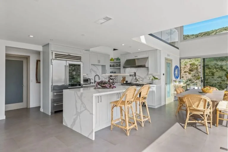
Carefully selecting interior design shades is an easy way to create a reliably stylish ambience in a home. These residences—from Fifth Avenue to California wine country—turn up the sophistication with swaths of calming neutral colors.
Introducing Pantone’s 2022 Color Of The Year | A Conversation With Leatrice Eiseman
Pantone’s Color of the Year is a highly anticipated announcement for design aficionados and consumers alike, and the color institute’s heralded shade for 2022 is Very Peri—a blue hue with warm red undertones that “encourages personal inventiveness and creativity”. As expected, there are many factors at play when making this selection. Here, Pantone Color Institute Executive Director Leatrice Eiseman shares her insights on this celebrated new shade, and suggests how to embrace it in one’s home.
Spring 2022 Pantone Colors Of The Year
Color can set the tone for an entire room, whether you want to ramp up the energy for lively dinner conversation, or create a zen-like sanctuary for relaxation.
Pantone, the world’s foremost authority on color trends, has released their predictions for the top shades for 2022. Their palette brings together comforting neutrals and delightful pops of bold colors in unexpected ways. Pantone’s report showcases a diverse collection of color to reflect a global desire for calm combined with a sense of optimism, joy, and adventure.
7 Tips to Warm Up Your Home in the Winter
Imagine, if you will, the perfect winter home. What does it look like? Is it a classic colonial with a foot of snow on the roof and smoke spiraling from the chimney? Perhaps the interior is crisp and bright, with sunshine streaming through the windows, blankets to warm cold toes, and a hot drink steaming on the stove. With a few thoughtful touches, any home can feel welcoming and warm, despite the chill outside.
Ways To Welcome In Maximalism Through Color
Minimalism has its appeal, but it’s hard to argue that maximalism doesn’t deserve its share of the design spotlight. In contrast to the pared-down aesthetics of minimalism and its Scandinavian neutrals, maximalism makes the claim that more is better. Instead of white walls and sparse decorative elements, think saturated colors, layered textures, and eclectic pieces that contribute to a bold and undeniably unique space.
If you feel ready to embrace maximalist design in your home, a good place to start is by introducing some color. Whether through a new coat of paint, punchy fabrics, or vivid greenery, a splash of color can be a great way to turn a space into a modern and carefully considered maximalist haven.
7 Trending Colours for Living Rooms
The living room is the heart of your home, and it’s also your most versatile space. While kitchens are for cooking, dining rooms are for eating, and bathrooms and bedrooms are self-explanatory, the living room is the only space dedicated entirely to relaxation and enjoyment—whether that’s decompressing with a good book or entertaining company.


