Spring 2022 Pantone Colors Of The Year
Color can set the tone for an entire room, whether you want to ramp up the energy for lively dinner conversation, or create a zen-like sanctuary for relaxation.
Pantone, the world’s foremost authority on color trends, has released their predictions for the top shades for 2022. Their palette brings together comforting neutrals and delightful pops of bold colors in unexpected ways. Pantone’s report showcases a diverse collection of color to reflect a global desire for calm combined with a sense of optimism, joy, and adventure.
Vibrant Brights
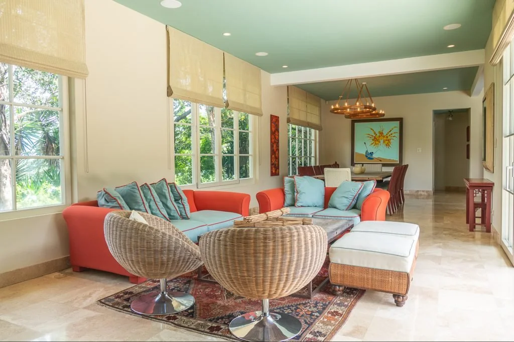
San Jose, Costa Rica | Costa Rica Sotheby’s International Realty
Upholstery that pairs hot Poinciana red-orange with cool Spun Sugar blue creates a focal point in this seating area that practically vibrates with energy. The tailored piping ties the colors together in a joyful pairing, while the soothing ceiling shade of Basil adds a sophisticated touch that balances the entire scene. Walls are reminiscent of Perfectly Pale, an updated beige that creates the perfect backdrop for playing with bolder colors.
San Francisco, California | Sotheby’s International Realty – San Francisco Brokerage
The ombre carpet runner on the stairs is a sumptuous addition to this Parisian-style residence in San Francisco. It cascades in rich jewel tones that include trending Skydiver and Harbor Blue. The inviting accent chair with its nod to Gossamer Pink provides a truly unexpected contrast and proves that the pastels of 2022 can deliver rich context within a modern color scheme.
Madrid, Spain | Madrid Sotheby’s International Realty
If there was ever a color that injected both fun and regality into a room, it’s Dahlia. The deep violet-plum provides a refreshing focus in this inviting living room. Lush velvet pillows offer both comfort and luxury with a splash of Innuendo when the light hits just right, while the wood tones on the grand double-door keep everything grounded with the right balance of warmth and welcome.
Cool Classics
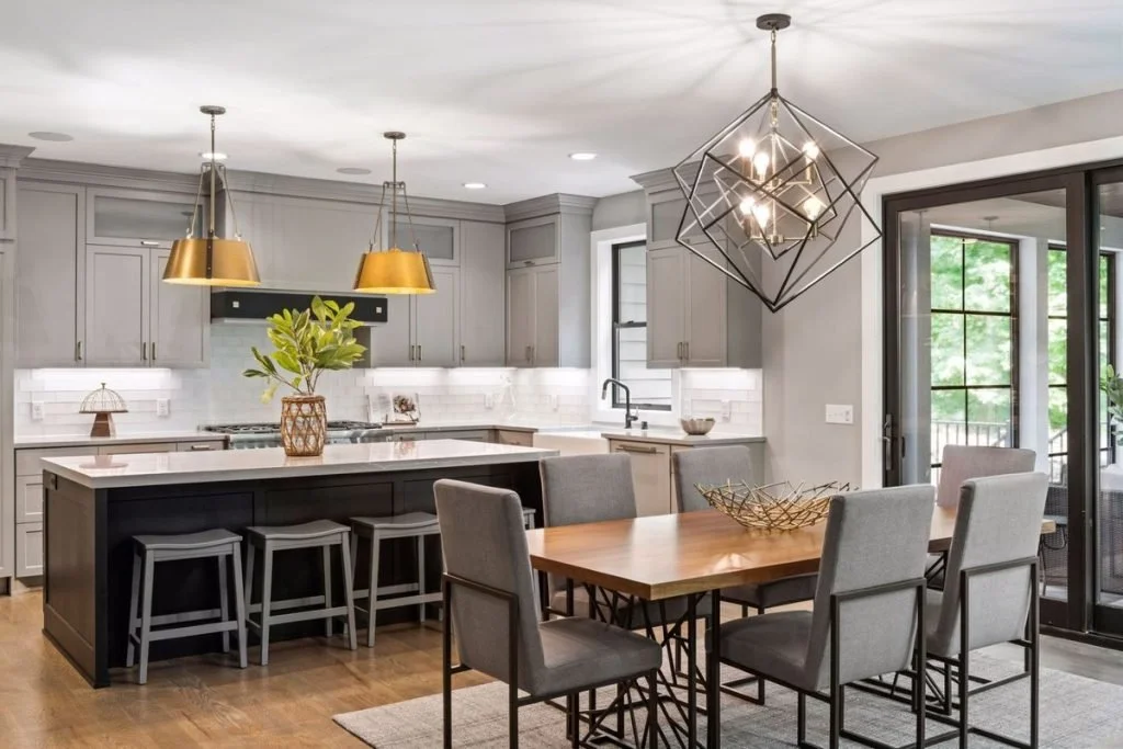
Shorewood, Minnesota | Lakes Sotheby’s International Realty
In contrast to high-energy primary colors and jewel tones, the other half of this year’s color palette focuses on restful neutrals for timeless sophistication. In this chic kitchen, the Snow White wallpops against cabinets painted the pale gray of Northern Droplet. This shade is matched in the bar stools and dining chair upholstery, where it plays against the deeper tones of the Poppy Seed-inspired island and cool metallic frames of the dining furniture.
San Miguel de Allende, Mexico | Agave Sotheby’s International Realty
This charming estate takes a cue from Pantone’s warm Coca Mocha for a natural exterior that harmoniously complements the property’s lush landscape. The earthy tone lends itself beautifully to contemporary Moroccan architecture and the front door’s impressive wooden carving. Whether strolling through the courtyards or relaxing poolside, the home’s espresso hue offers a welcome sense of calm, and proves that color trends aren’t just a consideration for interior design.
Newport Coast, California | Pacific Sotheby’s International Realty
Snow White shines in this bright living room, which gains interest from its playful use of geometry: diamonds on the ceiling, mod patterning on the tub chairs, and the hexagonal coffee table at the center. That pièce de résistance is decked out in this season’s best pastel, Gossamer Pink. The whole result is a mesmerizing study in texture and color that’s also highly livable.
Pantone’s color trend predictions for spring 2022 highlight what’s best about the current design moment: the timeless comfort of neutrals and the irrepressible joy of bright, bold hues. Taken together, the possibilities for creating a unique living space are endless.
This article was originally published in Sotheby’s International Realty’s Extraordinary Living Blog in December 2021.


