What’s New in Art, Architecture, and Design
What’s New in Art, Architecture and Design
Neon art, non traditional layouts, and curvy furnishings are gaining attention
Neon is reinventing itself as a 21st-century art form; residential layouts are flexing their nontraditional muscles; and furnishings are flaunting their curves. Here are the latest trends in art, architecture, and design.
Art
Artists are rediscovering the luminescence of the neon light, incorporating it into their works in innovative ways.
While some, notably Jenny Holzer, Bruce Nauman, and Tracey Emin, literally are spelling out messages in their think pieces, others such as Mary Weatherford are shedding new light on neon.
The Los Angeles-based painter started adding the colorful neon tubes to her large sponged-paint-on-linen abstract canvases in 2012.
The Sun, the Moon, and the Stars
Mary Weatherford Flashe and neon and linen, 117 x 234 in
Her inspiration came during a nighttime drive around Bakersfield, Calif., as the city’s colored neon signs took over for the setting sun. She began installing neon tubes in her paintings, screwing them to the canvas, and connecting them with thin wires to add an industrial element to her emotion-evoking works. The afterimages become an integral part of the art.
She saw the neon tubes as city lights. Brooklyn Bridge (2013) from her Manhattan series features two neon rods—one in warm yellow, one in turquoise—connected by a looped cord that suggests the structure’s suspension cables. In From the Mountain to the Sea (2014), which is part of her Los Angeles series, Weatherford juxtaposes the industrial blues and grays of the exuberant painted image with white and yellow lights.
Architecture
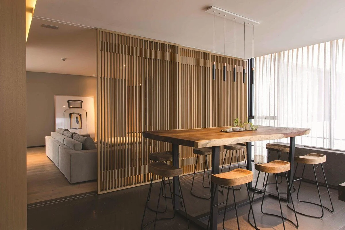
Flex spaces that feature movable walls, the ultimate form of customization, are replacing rigid room arrangements.
The panels, which are integral architectural and structural components of the home, are designed to be seamlessly arranged and rearranged at will, so adjoining rooms can interact with each other (or not).
“We also use them to help control sunlight entering a room,” says Ezequiel Farca of Ezequiel Farca + Cristina Grappin, which has offices in Mexico City, Los Angeles, and Milan.
In a renovation in Mexico City, the architects created a mobile lattice-style partition that opened a pool bathroom to a terrace, and for an apartment in Madrid, they used dividers to separate a child’s playroom from the family room.
Movable Architectural Panels
Movable architectural panels are used to separate living and dining areas
To define a private bar area in a formal living and dining area in a Mexico City apartment, the duo created a partition wall that becomes a solid cube when closed.
Farca and Grappin’s flex spaces were inspired by the dynamic partition walls of Gerrit Rietveld’s avant-garde 1920s Schröder house in Utrecht, the Netherlands.
Grappin says the idea is catching on today because people are looking for creative ways to expand square footage and make their homes more personal.
“The partitions allow the clients to become the creators of their spaces,” she says. “The architecture becomes organic; the house becomes something alive in a way.”
Design
In home decor, the sensuous silhouette is making a defined comeback. The right-angle edges of chairs, sofas, and tables are being replaced by robust curves that look and feel cozy and comfortable.
“People are responding to soft and sinuous forms because their beauty and sculpture become a respite and escape from the stress of everyday life,” says Los Angeles-based designer Kerry Joyce. “These pieces feel perfectly at home in either a minimalist or maximus environment.”
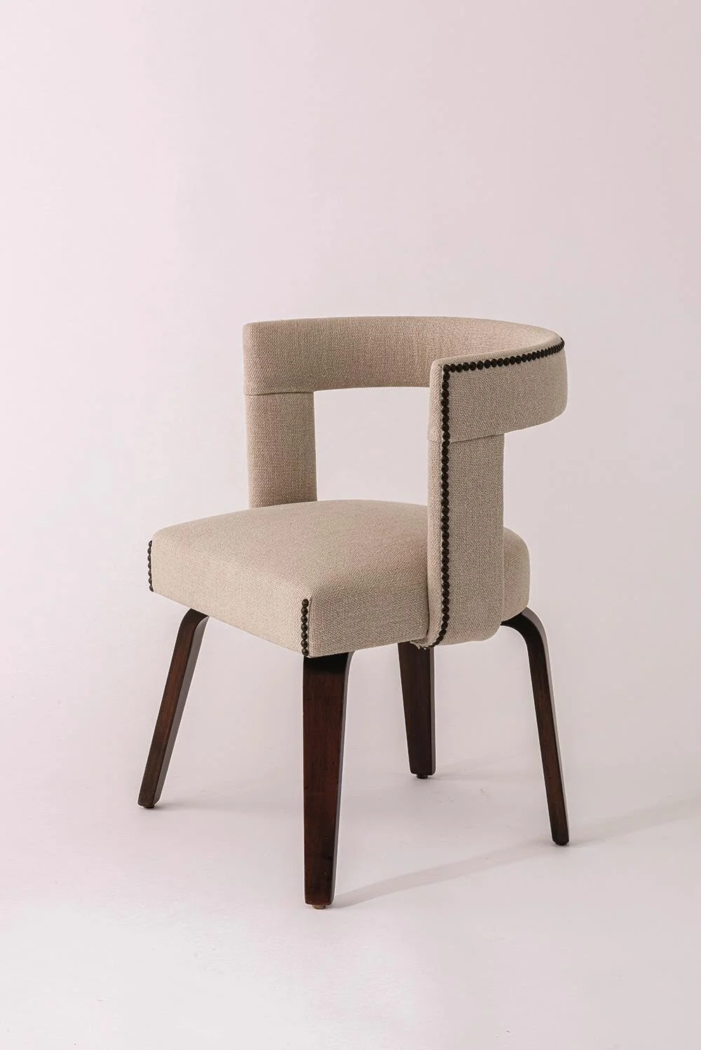
Joyce, who views furniture as functional sculpture, has taken curves full circle back to the forms of the 1950s with his Georgette Chair, which has a C-shaped back and arms that curl around the seat.
Georgette Chair
Kerry Joyce’s Georgette Chair
“It recalls a rather elegant version of the 1950s but at the same time feels almost timeless, which is something I always strive for,” he says.
Italian designer Simone Crestani’s Console Eterea wears its curves whimsically: Its handblown glass bubble legs are sandwiched between a pair of smooth-to-the-touch oval walnut panels. Paula Swinnen, who is based in Belgium, brings the curves of nature home with her Lily Pad tables, Monet-evoking creations whose golden hooped-earring bases proffer a trio of blue lily leaves.
Joyce says the new curved pieces call for cushy, feel-good upholstery. “I love a heavy, nubby linen or texture,” he says. “Short fleece–either real or faux–has become very popular.”


