
Pretty in Pink: Why Homes Are Falling for Blush This Valentine’s Day
As Valentine’s Day blossoms into full swing, the timeless romance of pink takes center stage - not just in bouquets and champagne hues, but in the very walls of extraordinary homes. From soft bougainvillea-kissed villas overlooking the Mediterranean to striking interiors that balance boldness with refinement, pink is having a moment as rich and layered as rose-tinted prose.
In the world of luxury design, color isn’t merely decorative - it shapes mood, memory, and emotion. While crisp white calms and rich reds stir passion, pink creates something more nuanced: a sense of warmth, joy, and quiet sophistication. It softens shadows, flatters natural light, and envelops a space in intimacy without ever feeling saccharine.
The Foundation: Choosing Refined Shades of Pink
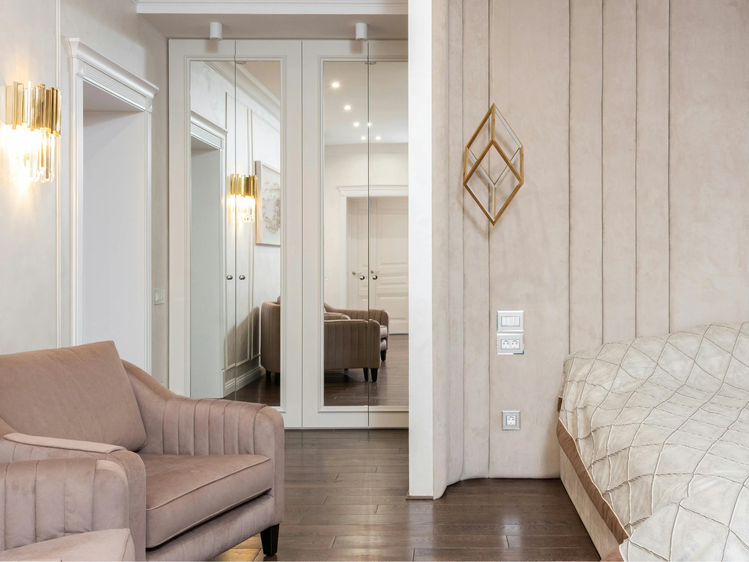
Pink, when thoughtfully introduced, has become a hallmark of refined living in many luxury interiors, including those featured by Sotheby's International Realty. The key to using this colour successfully lies in selecting soft, sophisticated shades such as blush, dusty rose, and muted mauve. These tones function almost like neutrals, creating warmth and elegance without overpowering a space. Applied to walls, upholstery, or subtle architectural details, these gentle hues establish a timeless and inviting foundation.
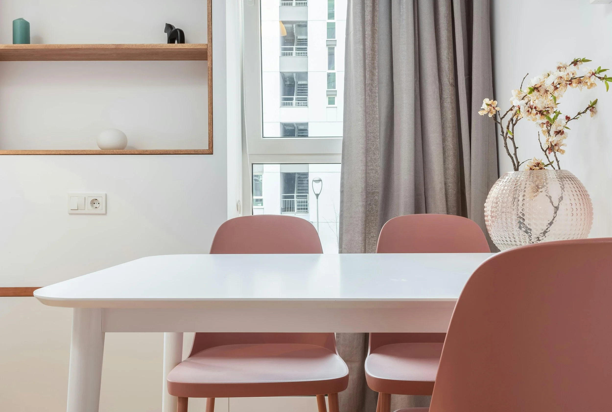
Subtle Statements: Accents and Textiles
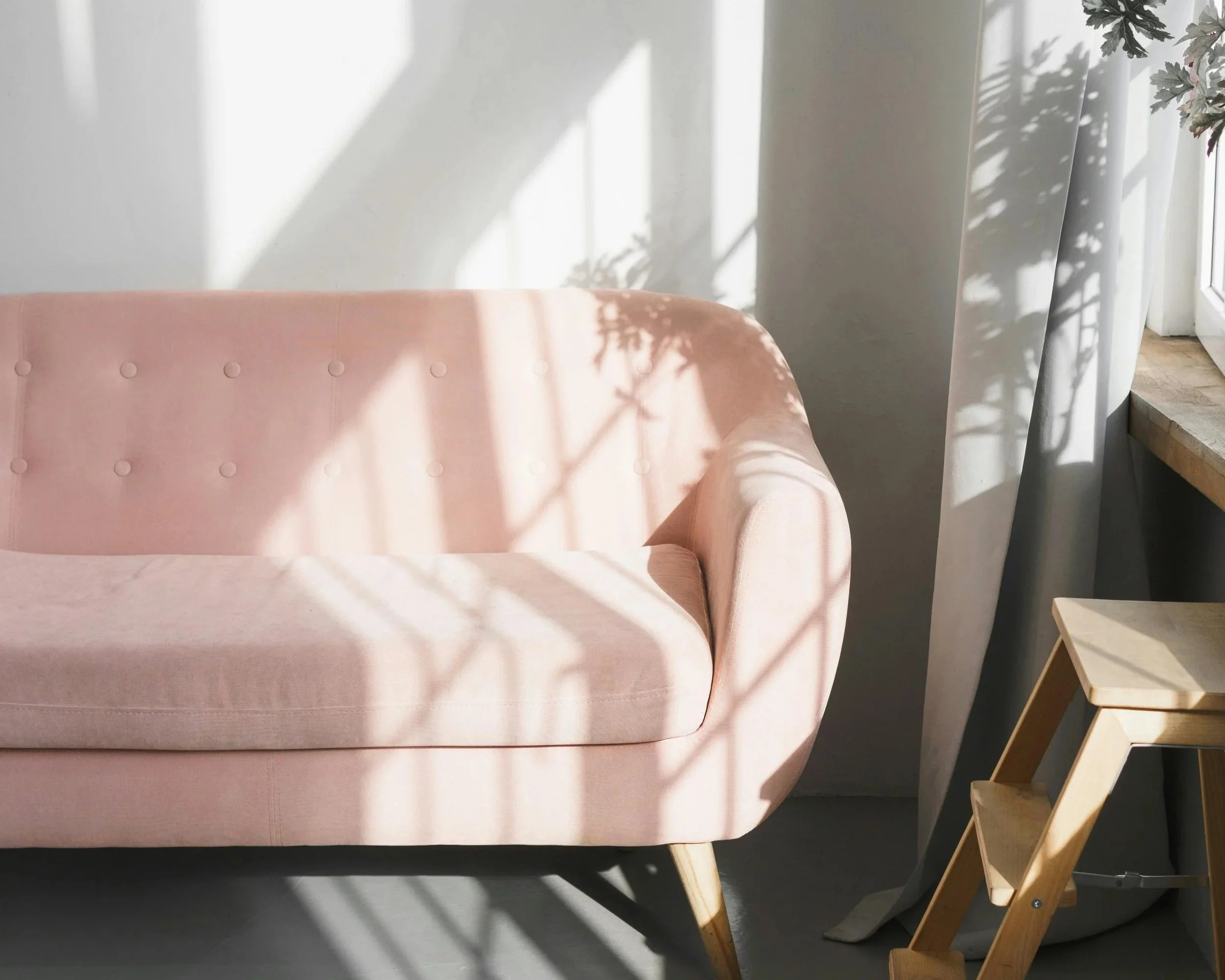
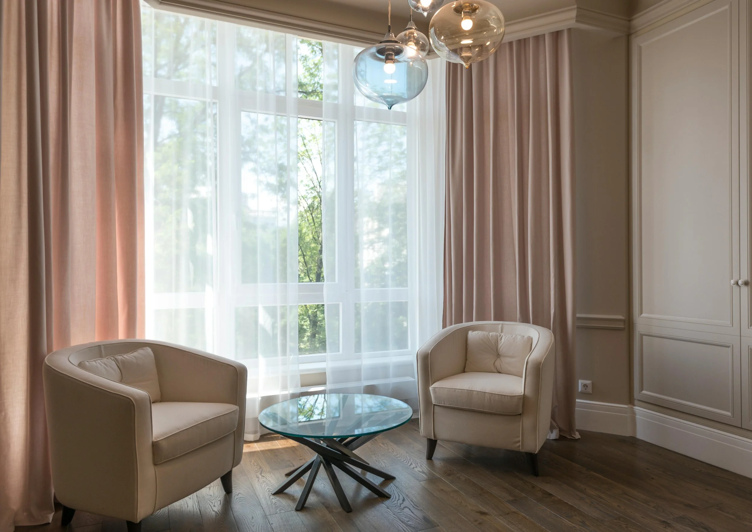
Rather than dominating a room, pink is most effective when used as a carefully placed accent. Through cushions, accent chairs, throws, or upholstered benches, it appears as a refined design detail—much like fine jewelry enhances an outfit. Textiles, in particular, offer an effortless way to introduce pink, as fabrics such as linen, velvet, and silk soften the colour and give it depth. Drapery, headboards, and dining chairs layered in these materials allow pink to feel intentional and luxurious rather than decorative.
Elevated Pairings: Materials and Finishes
What truly elevates pink in a high-end home is the quality of materials surrounding it. When paired with walnut, oak, marble, brass, or brushed gold, pink takes on a sophisticated, architectural presence. These contrasting textures ground the colour and prevent it from feeling overly delicate. A blush-toned wall beside stone surfaces or metallic lighting, for example, creates visual balance and reinforces a sense of craftsmanship and permanence.
Curated Touches: Art, Décor, and Intimate Spaces
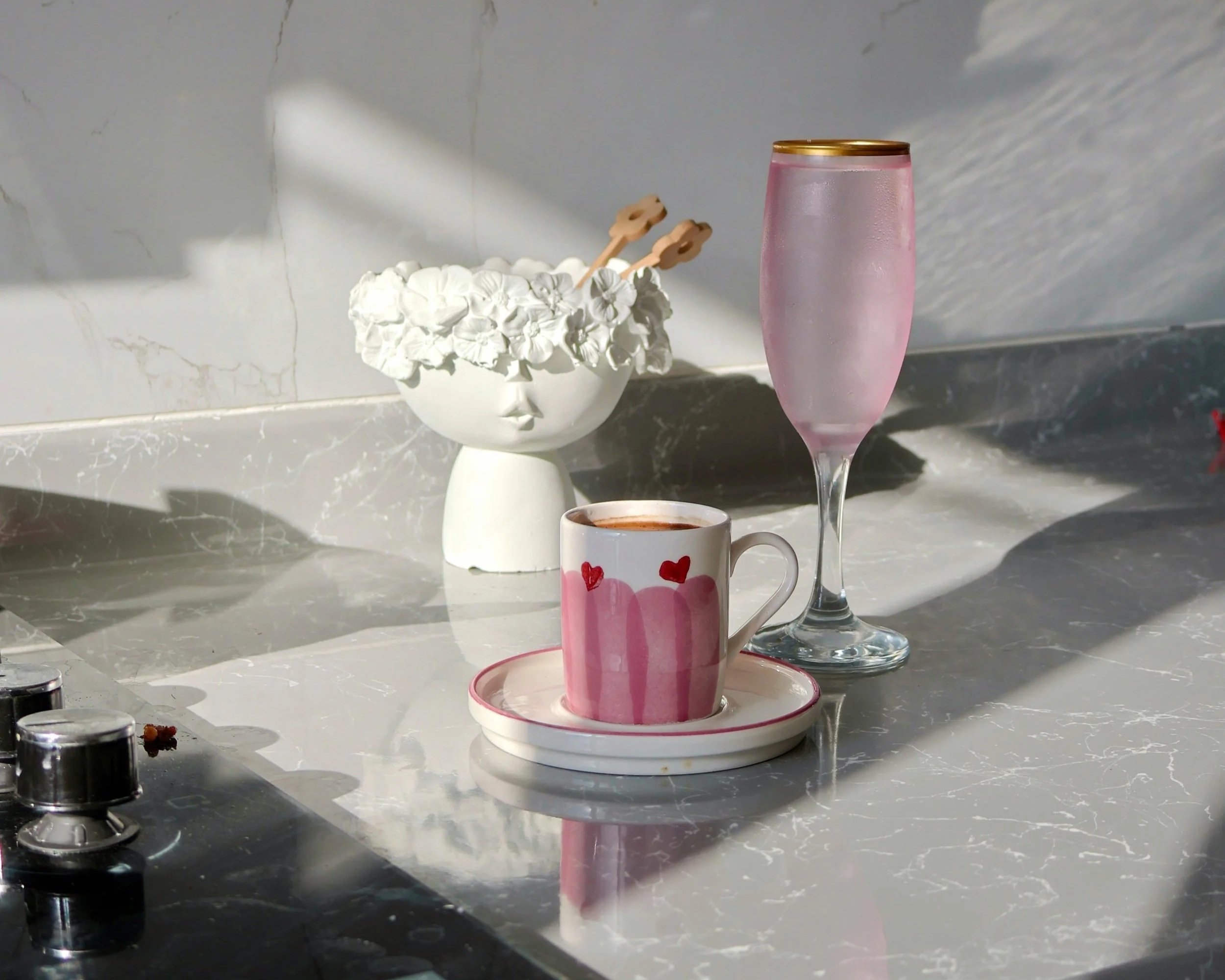
Art, accessories, and smaller spaces provide ideal opportunities to incorporate pink with restraint. Abstract artwork, sculptural ceramics, floral arrangements, and curated décor pieces introduce colour without permanence, allowing interiors to evolve over time. In powder rooms, walk-in closets, hallways, and reading nooks, pink feels especially intentional, creating boutique-like environments reminiscent of luxury hotels and private lounges.
Ultimately, successful pink interiors rely on harmony, lighting, and emotional resonance. Balanced with warm whites, soft greys, taupes, and natural woods, pink becomes seamlessly integrated into the overall palette. Thoughtful lighting enhances its depth, ensuring it reads as warm and inviting throughout the day. When approached as a lifestyle choice rather than a passing trend, pink brings romance, comfort, and quiet confidence to a home - making it both timeless and perfectly suited for moments of celebration, from Valentine’s Day to everyday living.